

 Vereinigte Staaten


Linen Bedding Color Combinations for a Serene Bedroom

Key Takeaways
-
Bed sheet color affects both the practical and emotional aspects of your bedroom.
-
Monochromatic palettes create sophisticated, calming spaces using tones of a single color.
-
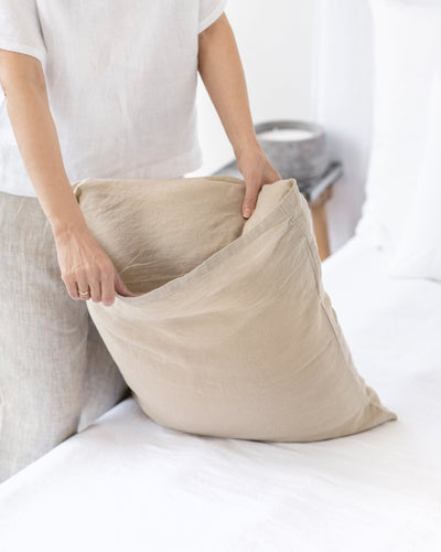
The secret to making white bedding feel rich rather than flat is texture variation.
-
Coastal cool tones work especially well in rooms with natural light, where they can shift and change throughout the day just like real coastal light.
Your bedroom should feel like a retreat: a place where color works with natural linen textures to create calm, restorative space. The colors you choose for your linen bedding don't just affect how your room looks; they influence how well you sleep, how relaxed you feel, and how the space supports your daily rhythms.
Linen's naturally relaxed weave and soft drape make it the perfect canvas for thoughtful color combinations. Unlike synthetic fabrics that can feel flat or artificial, linen holds color in a way that feels lived-in from the start, creating the kind of effortless elegance that invites you to slow down and breathe deeper.
Why Choose Linen Bedding
Choose linen because it brings something synthetic materials simply can't match; a natural breathability that keeps you comfortable through the seasons. Made from European flax, linen products get softer with every wash, developing the kind of character that only comes with time and care.
Linen's unique texture enhances whatever colors you choose. The natural variations in the weave catch light differently throughout the day, so your sage green sheets might look fresh and bright in morning light, then settle into something more muted and soothing by evening. This quality means your bedroom feels dynamic without being busy.
The durability of quality linen bedding means your color choices become a long-term investment. Rather than replacing bedding every year or two, you're choosing colors you'll love for years to come; colors that improve with age rather than fade or pill.
Understanding Basic Color Theory for Your Bedroom

Color theory might sound academic, but it's simply about understanding how colors work together to create the feeling you want in your space. When you're choosing linen bedding colors, beyond picking what looks pretty, you're setting the emotional tone for where you begin and end each day.
Monochromatic palettes
A monochromatic palette uses different shades, tints, and tones of a single color family. Think of it as exploring all the possibilities within one color rather than jumping between different hues.
Monochromatic palettes create sophisticated, calming spaces because there's no color competition. Everything works in harmony. Your eye can rest rather than constantly processing different color relationships. In a bedroom, this translates to a space that feels immediately peaceful.
For example, you might combine light grey linen sheets with charcoal pillowcases and a slate grey throw. Each piece adds depth while maintaining that sense of cohesion that helps your mind settle as you prepare for sleep.
Analogous palettes
Analogous colors sit next to each other on the color wheel, like the way blue flows into green, or how orange melts into red. These combinations feel naturally harmonious because they share underlying color elements.
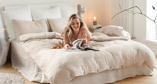
In bedding, analogous palettes create spaces that feel cohesive yet interesting. You might combine soft sage green sheets with dusty blue pillows and seafoam accents. The colors are different enough to create visual interest but similar enough to feel intentionally connected.
This approach works beautifully in bedrooms because it mimics the subtle color variations you see in nature: the way ocean colors shift from deep blue to green to pale foam, or how a forest contains dozens of greens that somehow all belong together.
Complementary palettes
Complementary colors sit opposite each other on the color wheel. Think blue and orange, or red and green. Used thoughtfully, these combinations create energy and visual interest without being overwhelming.
The key with complementary palettes in bedding is balance. You might choose warm terracotta linen sheets and add just a few deep blue accent pillows. The blue becomes a focal point without dominating the space, while the terracotta provides a grounding base that feels warm and inviting.
Complementary palettes make your bedroom feel more dynamic while still being restful. The contrast keeps the space from feeling too sedate, while careful proportions ensure it never feels jarring.
Timeless Linen Color Combinations

The most enduring bedroom color combinations are those that connect with something deeper than current trends. They work because they echo colors and combinations we find naturally soothing: the muted tones of weathered wood, the soft gradations of morning light, the quiet colors of shells and stones.
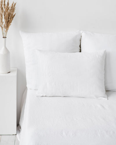
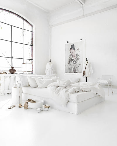
The all-white bed
White linen bedding creates a blank canvas that never goes out of style. But rather than feeling stark or clinical, white linen has a softness that feels welcoming and serene.
The secret to making white bedding feel rich rather than flat is texture variation. Combine smooth percale linen sheets with a chunky waffle weave throw, or pair stonewashed pillowcases with a lightly textured duvet cover. Each white piece brings its own character while contributing to an overall sense of clean calm.
White also reflects light beautifully, making your bedroom feel larger and more airy. In smaller spaces, white bedding for summer creates the illusion of spaciousness while maintaining that cocoon-like comfort you want in a bedroom.
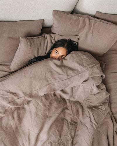
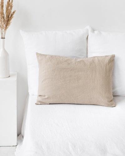
Earthy and grounded neutrals
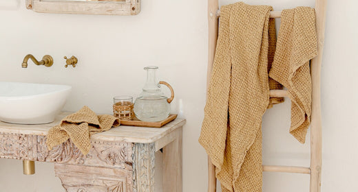
Natural earth tones, like oatmeal, warm beige, soft terracotta, create bedrooms that feel connected to the natural world. These colors ground your space in something timeless and universally comforting.
An oatmeal linen duvet cover paired with terracotta pillows and a soft beige throw creates layers of warmth without being heavy or overwhelming. These colors work especially well in rooms with natural wood furniture or exposed beams, creating a cohesive story about natural materials and honest craftsmanship.
Earth tones also have the advantage of being incredibly versatile. They work with brass fixtures or black iron, with vintage wood or sleek modern furniture. They provide a calm backdrop that lets other elements in your room shine while never competing for attention.
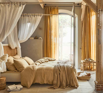
Coastal cool tones
Blue and white combinations never feel dated because they echo something elemental: sky and clouds, ocean and foam. But coastal colors go beyond basic navy and white to include the subtle blue-greys of weathered driftwood and the pale greens of sea glass.
Combine white linen sheets with dusty blue pillowcases and perhaps a soft grey-blue throw. Add natural textures like a jute rug or rattan bedside table, and you've created a space that feels like a permanent vacation without being theme-y or obvious.
These colors work especially well in rooms with natural light, where they can shift and change throughout the day just like real coastal light. The result is a bedroom that feels fresh and calming—perfect for both energizing morning light and peaceful evening wind-down.
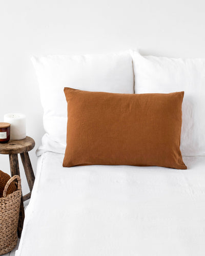
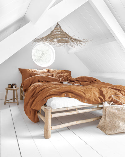
Warm and rich tones
If earth tones feel too neutral for your taste, warm, rich colors like rust, mustard, and clay create bedrooms with more personality while still feeling grounded and restful.
A rust-colored linen duvet cover becomes the focal point, while mustard pillows and perhaps a warm clay throw add layers of related warmth. These colors work beautifully with dark wood furniture and create bedrooms that feel especially cozy during cooler months.
Rich warm tones also photograph beautifully in golden hour light, creating bedrooms that feel Instagram-worthy without trying too hard. More importantly, they create spaces that genuinely feel good to be in, enveloping and comforting without being overwhelming.
How to Accessorize Your Color Palette

Once you've chosen your core bedding colors, thoughtful accessories help create a layered, professional look that feels intentional rather than accidental. The goal is to add depth and interest while maintaining the serene feeling that makes bedrooms truly restful.
-
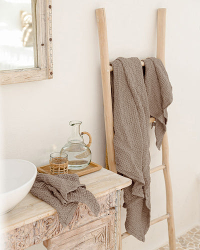
Layer with throws and quilts: A different texture or complementary color in your linen throw blankets adds visual weight and interest. If your bedding is smooth, try a chunky knit throw. If your duvet is textured, balance it with something sleeker.
-
Use decorative pillows: Linen pillowcases in a slightly different shade or texture can introduce a new element without overwhelming your carefully chosen palette. Two or three pillows maximum can be enough to add interest without creating clutter.
-
Connect with room decor: Your bedding should feel intentionally connected to the rest of your bedroom. If you have warm wood nightstands, choose bedding colors that complement rather than compete. If your walls are a soft grey, let that inform your linen choices for a cohesive, pulled-together look.
Wrapping Up
Creating a serene bedroom with linen bedding colors comes down to understanding how different combinations make you feel, then choosing colors that support the kind of rest and relaxation you need. Whether you're drawn to the clean simplicity of all-white bedding, the grounding warmth of earth tones, or the fresh calm of coastal colors, the key is choosing colors that feel authentic to how you want to live.
Linen's natural beauty means your color choices will only get better with time. The colors will soften and deepen, the textures will become more lived-in and comfortable, and your bedroom will develop the kind of effortless elegance that can't be rushed or faked.
Trust your instincts, start with colors that genuinely appeal to you, and remember that the best bedroom is one that makes you feel genuinely happy to be there.
Frequently Asked Questions (FAQs)
What is the most practical color for linen bed sheets?
Neutral colors like oatmeal, natural white, or soft grey are the most practical choices for linen sheets. They hide minor stains better than pure white while still feeling fresh and clean. These colors also work with changing decor and seasonal accessories, making them a smart long-term investment.
What is the importance of bed sheet color?
Bed sheet color affects both the practical and emotional aspects of your bedroom. Lighter colors reflect light and make spaces feel larger, while darker colors create a cocoon-like feeling that some find more restful. Color also influences mood: cool blues and greys tend to feel calming, while warm earth tones create a sense of security and grounding.
Should your sheets match your duvet?
Your sheets don't need to match your duvet exactly, but they should feel intentionally coordinated. Matching creates a clean, hotel-like look, while coordinating different shades or textures in the same color family adds visual interest. The key is ensuring all pieces feel like they belong together rather than looking accidentally mismatched.
What is the most relaxing bed sheet color?
Soft, muted colors tend to be most relaxing: pale blues, soft greys, warm whites, or gentle earth tones like sage green or oatmeal. These colors don't overstimulate the eye and help create the kind of calm environment that supports good sleep.